Tables and figures are used to display complex data in academic papers. They should not be used to display data that could be summarized in a few sentences. Each table or figure should be clearly drawn and easy to interpret, and should contain enough information that its contents can be understood without reference to the text. The text should be used to draw attention to extremes, trends, and other key features of the data, rather than simply repeating data the table or figure provides.
When tables and figures are required for an assignment, they must be incorporated correctly:
Number tables and figures separately and sequentially (Table 1, Table 2... and Figure 1, Figure 2...)
Guide the reader to the appropriate table or figure by introducing it in the text:
Minimum wage has increased since 2007 (Table 1).
Figure 3 demonstrates that...
Tables
Use a table when it is important to show precise values, or to facilitate comparisons between groups.
Table captions (labels) must be placed above the table. Captions should include the following:
Table number
An informative title
Any additional details necessary for understanding the data can appear above or below the table, depending on the style being followed. These details may include the following:
A brief description of table contents
Explanations of any abbreviations used in the table
Citations for any non-original data
Data should be well organized:
Label columns and rows clearly and indicate units
Arrange discrete variables in columns instead of rows
Organize variables in a logical order, to be read from left to right
Use a consistent display format (e.g. number of decimal places)
Incorrect Table

Table 1. Wages and inflation.
Errors:
Caption appears below the table instead of above
Caption is incomplete, as it lacks information on what geographic region and what category of wage this data represents, and no citations or source information are provided.
Data is arranged in rows instead of columns, making the table harder to understand
Labels are missing or unclear (e.g. what does “change” mean?)
No units are provided – dollar values and percentages can’t be distinguished
Meaning of zero values is uncertain
Table 1 could not be understood without referring to the text.
Correct Table
Table 2
Changes in Nova Scotia’s minimum wage relative to Canada’s inflation rate

Note: Minimum wage data obtained from the Government of Canada’s Labour Program website.Inflation rate data taken from inflation.eu.
Table 2 is well organized and clearly labeled. Enough information is provided that the data and its significance can be understood from the table alone.
Figures
Figures are visual displays of data such as photographs, illustrations, maps, or graphs. All types of figures should have captions (labels) that use the following format:
Appear below the figure
Include a figure number and informative title
Provide any additional details necessary for understanding the data, such as
A brief description
Explanations of any abbreviations
Citations for any non-original data
Graphs are used to make comparisons, show trends, or establish relationships in the data. The type of graph used depends on the nature of the data, but in general they should reflect the following considerations:
Each axis must clearly labeled
Units should be given in the axis label, not the scale
A legend or key must be included if multiple data sets are shown
Colour should only be used only for complex graphs that can’t be understood in black and white
Types of Graphs
Bar graphs are used to compare independent values.

Figure 1. Comparison of Canadian minimum wages in 2014. Data from www.retailcouncil.org.
Line graphs show the relationship between two variables.

Figure 2. Number of maggots observed on steak samples contained in sealed or open jars.
Pie charts compare proportions of a total.
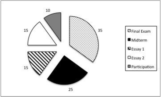
Figure 3. Contribution of course work to final grade (%).