Brightspace Accessibility
Improve the Accessibility of Your Course Content Pages
With the launch of the Saint Mary's University Accessibility Plan, the university has committed to meeting the needs of people who face barriers to accessibility to ensure the campus is an inclusive space for learning and working. Instructors, faculty, and staff play an important role in facilitating this goal. Creating accessible content in Brightspace is one simple way to remove some of the barriers to education that learners face.
On this page you will find information on:
Brightspace Accessibility Checker
When websites support web accessibility standards, are compatible with assistive technologies, and are easy for people to navigate and understand, a higher degree of web accessibility occurs. D2L follows these trends closely and works with clients to test the usability of their products for people with disabilities. As a result, D2L has incorporated the latest web accessibility standards (currently WCAG 2.1) into Brightspace.
The Accessibility checker makes it easier to improve the accessibility of your content pages. The Accessibility checker reviews your added content and looks for the following items:
- Use of paragraphs as headings
- Sequential headings
- Adjacent links
- Ordered list structure
- Contrast ratio of text to background colours
- Image ALT text
- Table Caption
- Complex table summary
- Table caption and summary
- Table heading scope, markup, and headers.
The checker indicates if there any accessibility issues and offers suggestions on how to fix them. Expand the content below to learn more about the Brightspace Accessibility Checker.
How To Run the Accessibility Checker
The Accessibility Checker is built into the HTML editor in Brightspace. You are able to use it on any Content page you create as well as any other instance in Brightspace where the HTML Editor is used, like the news items, discussion and assignment descriptions, and discussion posts.
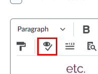
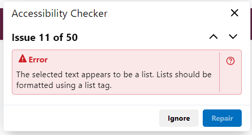
To use it in Content, open one of your content pages or create a new page by clicking New, then selecting Create a File. Once you have inserted content unto your page, click the Check Accessibility button in the HTML Editor ribbon as seen in the image below.
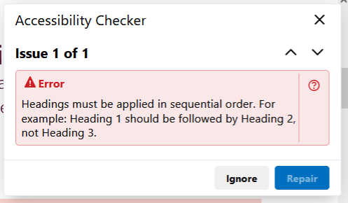
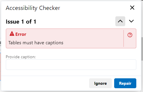
This will open a new dialogue box which will display any Accessibility issues detected (see screenshot below). The up and down arrows can be used to cycle through the errors, if there is more than one.
The following sections go through how to fix some of the accessibility issues the checker may find.
Image Alt Text
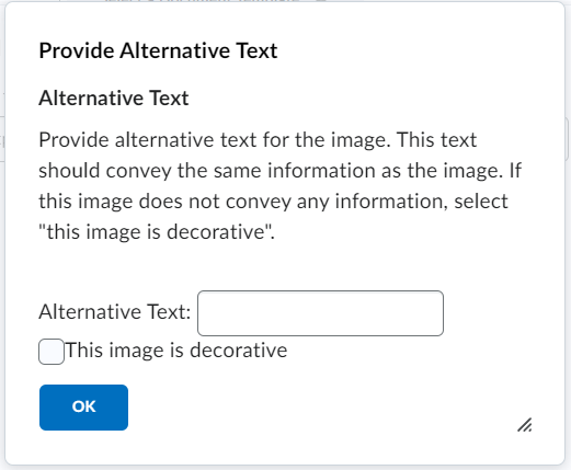
Image Alternative text (alt text) is the most common accessibility issue likely to be raised by the Accessibility Checker. Alt text is not displayed on the image; however, it is read by screen readers. This helps individuals with visual impairments as it allows them to access the relevant information without needing to see the image in question. As per HTML standards, every image requires alt text.
When you add an image to Brightspace, you will be prompted to add alternative text (see screenshot below). Take note of the checkbox labelled This image is decorative. If an image is only for decoration and does not provide any information to the students, this option should be chosen. Brightspace will not allow an image to be inserted without alt text or an acknowledgement that the image is decorative
Colour Contrast
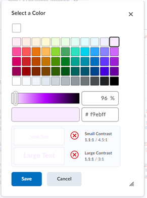
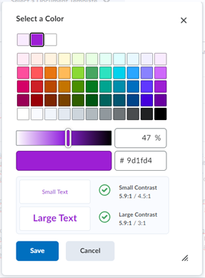
Colour Contrast is the difference between adjacent colours, typically a font and a background. The contrast ratio is a mathematical expression of this relationship, ranging from 1:1 to 21:1. For Accessibility purposes, a ratio of 4.5:1 is required for text and a ratio of 3:1 is required for Large text.
When using the HTML editor, changing a font colour will open a built-in colour picker that checks for these required ratios (see below).
Bad contrast Ratio vs. Good contrast Ratio
Headings
Although headings can be created by bolding text or increasing font size, these methods neglect individuals with visual impairments. Screen readers will not be able to interpret this formatted text correctly. Instead, use the built-in Heading styles within Brightspace. Using these Headings will enable screen readers to correctly interpret the information and provide users with the hierarchy of the page content. In addition, it allows them to access specific sections more easily if needed.
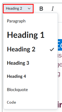
Headings can be selected via the HTML editor (see image above). If you are using on of our branded HTML pages, then the headings will also be stylised with the university colours.
It is also important to note that Headings should be used in a sequential order. This means that Heading 2 (H2) should only be used after Heading 1 (H1), H3 after H2, etc. If Headings do not follow a sequential order, individuals using screen readers may be confused or unable to make sense of the hierarchy of the content. Importantly, this will be raised as an issue by the Accessibility Checker.
Using Lists
Similar to Headings, lists provide visual structure to information which can be difficult to convey to users with impairments. As such, care must be taken to ensure that lists are created with the correct type and in a uniform manner. The HTML editor has two List types: ordered and unordered. An ordered list has a specific sequential order, such as rankings on a leaderboard. By contrast, an unordered list is composed of items without a specific order, such as menu options.
In order to correctly use Lists, select the items that compose the list and select either the Bulleted List option or the Numbered List option (see screenshot below).
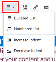
If items are listed below a list but are not properly tagged as a list, it will be raised as an issue by the Accessibility Checker.
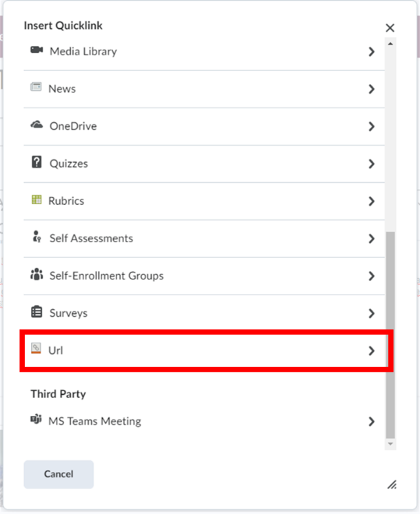
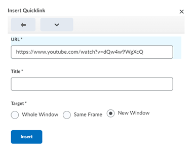
Descriptive Hyperlinks
Hyperlinks act as a bridge between the current webpage and other internet content. To add a hyperlink, click the Insert Quicklink icon and select URL in the pop-up window (see screenshots below).

You will then be prompted for a URL and a Title (see screenshot below). The Title is the text that will displayed instead of the URL. For Accessibility purposes, keep these practices in mind:
- Hyperlink Text should be descriptive, users should know where the link will take them before they click on it.
- Do not use the URL as the Title. URLs often do little to describe the link’s destination and can be confusing for individuals using screen readers.
- Avoid phrases such as “click here” or “more”; these give no indication of the content of the link and provide little for screen readers to communicate.
- Avoid adjacent links. Hyperlinks that are placed next to each other can be confusing for users and screen readers, especially if these links point to the same location.
Tables
Tables are an excellent way to communicate complex information because the organization of rows and columns can indicate relationships to users. However, users with visual impairments do not benefit from this representation. Indeed, Tables that are not created correctly can be detrimental to individuals who use screen readers as they will be presented with disjointed tabular data.
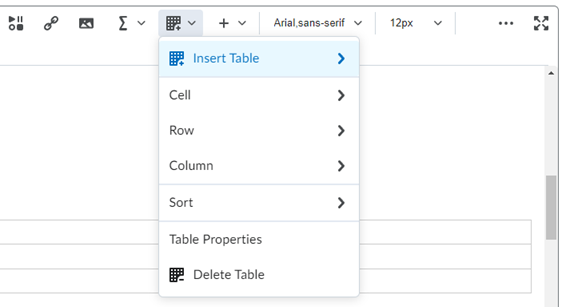
Tables can be created within the HTML editor, by clicking on the Table button followed by Insert Table. You can create up to a 9x9 table using the tool or click on More Options if you require more rows/columns.
Once your Table has been created, you can adjust the overall settings by selecting the table (or a cell in the table), clicking on the Table button, and selecting the Table Properties option. Importantly, this is also where the option for displaying a caption can be found (see screenshot below).
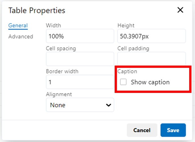
A Caption is a brief description of the Table that must be included to meet Accessibility Requirements. If a caption is not added via the option above, it will be flagged by the Accessibility Checker.
In addition, Tables also require Headers if they are to be read correctly by screen readers. To add a row or column header, select the relevant cell in the question, click the Table button, and then the Cell Properties option. In the Cell Properties menu, change the Cell Type to Header cell and change the Scope to Row or Column:
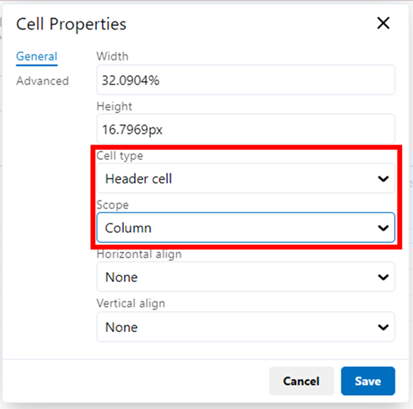
The Scope will define which elements fall under that specific Header. This means that if the Scope is not set (or set incorrectly), screen readers will be unable to read the Table or will read it out of order.
Using Video Note
Video Notes allow Instructors to post video content to Brightspace, equipped with generated captioning. This is a powerful tool for Instructors because it allows for accessible content to be created quickly and directly in the Brightspace editor.
How to record and insert a Video Note in Announcements, Discussions, and Assignment Feedback
Video Notes can be added via the Brightspace HTML Editor and used to supplement course content. In addition, Video Notes can also be used in News items, Discussions, and Feedback.
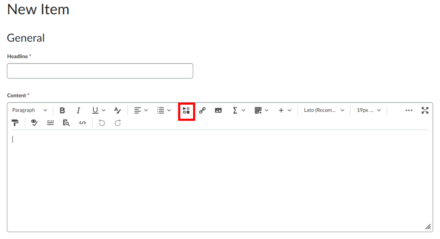
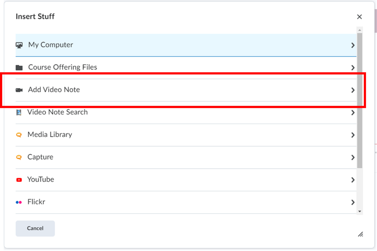
In order to add a Video Note through the Brightspace HTML editor in the tool you are using, click the Insert Stuff button, followed by the Add Video Note option (see screenshots below). You can then upload a video or record one using your device.
How to enable Automatically Generated Closed Captions in your Video Notes
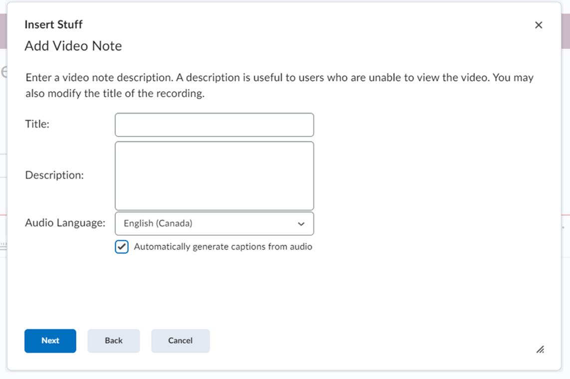
In order to add Generated Closed Captions, select the corresponding Audio Language (if it is not detected automatically) and click the Automatically generate captions from audio checkbox (see screenshot below).
Adding Closed Captions on Videos uploaded to Content
With its January 2022 update, Brightspace received a new Audio-Video experience that provides new editing tools and capabilities. One of these tools was the auto-captioning and caption editing system, which we will discuss below. For details regarding other elements of this updated Audio-Video suite, please refer to the Brightspace Audio Visual Experience webpage.
Adding Closed Captions to Brightspace content can be done by following these steps:
-
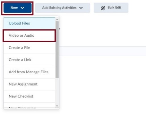
Navigate to the course and desired module in Brightspace, click New and select the Video or Audio option.
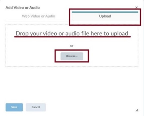
- In the Add Video or Audio window, select the Upload tab.
-
Drag your file into the upload space or use the Browse button to find your file manually. Click Save.
-
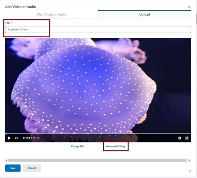
Once the content has been uploaded, enter a title and select the Advanced Editing option at the bottom of the video.
-
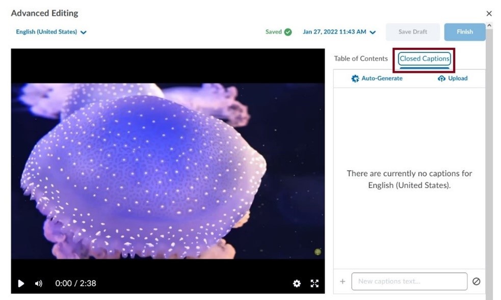
The Advanced Editor allows us to set the language of the video and generate/manage Closed Captions. Click the Closed Captions tab.
-
From here, a caption file (.srt or .vvt) can be uploaded; otherwise, captions can be auto-generated by clicking the Auto-Generate button.
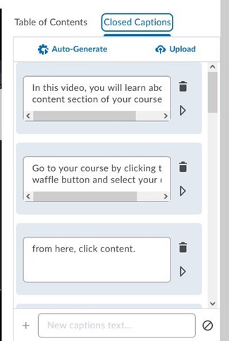
- Captions can be edited by clicking the dialogue box and editing the displayed text. Embedded time codes can also be altered, and individual segments can be deleted via the garbage can button.
- Once satisfied, click Save Draft followed by the Finish button.
Using HTML Templates
The Studio for Teaching and Learning at Saint Mary’s University has developed and shared HTML templates on Brightspace in an effort to make it easier for professors and instructors to create accessible, professional looking HTML content files. The templates use a cascading style sheet (CSS) to format the content in HTML files. The accessibility features are built into the CSS file, allowing the content developer to concentrate on adding text, images, and other course resources without concern for proper formatting.
To view a complete guide on using HTML templates in your course click here.
Supporting Students with Low Vision
Low vision is characterized as any condition that reduces an individual’s ability to perform visual activities. Although glasses and other treatments can alleviate issues for some, many still struggle with tasks that require vision. Therefore, Instructors should be aware of the issues that Low Vision Users are facing and tailor their material to be as accessible as possible.
Understanding Low Vision Users and their Needs
Low vision is a wide umbrella and encompasses individuals with blurry vision, cataracts, color blindness, spotty or blocked vision, etc. Therefore, Low Vision Users have a variety of needs that can be addressed. These can be broken down into two key sections: Visibility and Navigation. Visibility encompasses magnification, colour reliance, contrast, and the appearance of text. Navigation is concerned with the layout of content, indicators for keyboard navigation, and enlarged/modified mouse pointers. How Instructors can support these needs will be explained in the proceeding sections.
The list below illustrates some needs that low vision learners may require in order to properly view and underdstand content on the web.
- Increased Contrast of Text and Images
- Inversion of Colours to Improve Visibility
- No Reliance on Colour Perception
- Keyboard Navigation Focus
- Enlarged Mouse Pointer
- Zooming Screen Content
- Avoid Horizontal Scrolling
- Font Face and Size
- Proximity of labels
- Text Spacing (Lines and Letters)
- Consistency
Expand the sections below to read more about how to support low vision learners.
Assistive Tools - Screen Magnifiers
Assistive Tools can be used by Low Vision Users to support some of the needs mentioned above. For example, Windows and MacOS both have built-in screen magnification tools and pointer options. Although Instructors are not expected to use these tools themselves, they can provide information to students who need them.
Windows has a built-in Screen Magnifier that can be activated by pressing both the Windows and the Plus (+) key. It can be deactivated with Windows key + Escape key. The Magnifier has a variable zoom level and zoom window, a colour inverter, and cursor options. MacOS has a similar tool as well. It can be activated by selecting the Apple Icon > System Preferences > Accessibility > Zoom.
ZoomText Magnifier and ZoomText Fusion are software that provide Magnification as well as additional features like document reading and typing echoes. However, these software packages are not freely available, and students may not be able to accommodate the price.
Finally, there are also Browser Plug-Ins that can support Low Vision Users. Plug-Ins such as High Contrast, Whitebuster, and Change Page Colors are available for Google Chrome and allow users to change how webpages are displayed.
Tools:
- Device Accessibility Settings
- Built-in screen magnifier for Windows
- Built-in screen magnifier for MacOS
- Software
- ZoomText Magnifier/Reader
- ZoomText Fusion
- Browser Plug-Ins
- High Contrast
- Whitebuster
- Change Page Colour
Brightspace Accessibility Features
Features:
- Font Size
- Colour Contrast Checker
- Responsive Display
- Other:
- Compliant with Accessibility Standards
- Supports Scaling & Contrast options
- Fully Accessible Keyboard Experience
- No Colour-Only information display
- Equation Editor allows for easy re-sizing
For more information on how to use these features in Brightspace, please view the information above on the Brightspace Accessibility Checker.
Creating Accessible Content
Designing content that is accessible for Low Vision Users follows many of the steps mentioned in the Accessibility Checker section above; however, they will be reiterated and highlighted for Low Vision Users specifically.
Visibility:
- Text should have a colour contrast of 4.5:1
- Images should have a colour contrast of 3:1.
- Font should be at least 12 pt for Body text.
- Use sans-serif fonts if possible.
- Convey information in multiple ways (text, colour, and shapes).
- Do not use images of text instead of text.
- Minimize the use of Bold, italics, or ALL CAPS as they can be difficult to read.
- If possible, use vector image formats (such as SVG or PDF) instead of rastor formats (JPG, PNG) due to the latter’s scaling issues.
Layout:
- Use a linear and vertical layout
- Avoid horizontal scrolling.
- Use white space effectively; too much or too little can cause difficulties for users.
- Buttons, input fields, and labels should be placed closely to the content they are associated with.
For more information on how to use these features in Brightspace, please view the information above on the Brightspace Accessibility Checker.
Supporting Screen Reader Users
Screen Readers are software that provide another method for users to interact with digital content. Although it might be assumed that Screen Readers are only used by individuals with total or partial blindness, this is not always the case. Screen Readers can provide information about what is displayed by the computer and can also perform tasks such as reading documents, opening and closing files, navigating webpages, etc. Screen Readers can use Audio or Tactile (Braille) methods to convey information to users.
Creating Accessible Content for Screen Reader Users
In order to create content that can be understood and communicated by Screen Readers, Instructors should be aware of the specific needs of Screen Reader Users. Many of these were mentioned in the above Accessibility Checker section; however, they will be reiterated and highlighted for Screen Reader Users specifically.
Alt Text
Images can be used to efficiently convey information; however, users who require Screen Readers can miss out on information that is communicated this way. Alt Text alleviates this issue by being a written description that screen readers can interpret and provide to users. As such it is important that every image (except for decorative images) have associated Alt Text.
Semantic Markup
Information that is communicated by layout (headings, tables, lists, etc.) requires specific formatting for Screen Readers to interpret it correctly. If proper steps are not taken, a Reader may present information out of order (headings, lists) or a confusing cell-by-cell reading (tables).
Screen Readers and Math
Brightspace is equipped with various equation editors for adding mathematic expressions: Graphic, MathML or Latex. Math inputs are then converted and stored as MathML, which most Screen Readers are compatible with.
Back to top